ce-autoloader
Load web components on demand
if and when they're needed.
About
The ce-autoloader is a lightweight web Components lazy loader.
- Universal: Anything that exports a Web Component works (React, Vue, Lit, Svelte, etc.).
- Shared Catalog: Define your components in a single place and re-use it across multiple pages.
-
Performance: Use
loadingattribute to customize when a component should be loaded, maximizing network performance with minimal overhead. - Wildcard Loaders: Wildcard loaders allow you to load a whole design system with minimal footprint.
- Polished Animations: Use the lifecycle states and View Transitions API to animate components as they load/render, providing a smooth and polished user experience.
- Smart Scheduling: Automatically batches upgrades into single animation frames to prevent layout thrashing.
- Native Telemetry: Built-in performance markers for every stage of the lifecycle, visible in the Performance DevTools.
- Error Handling: Define a custom fallback component to show when a module fails to load.
- Tiny: 3kb gzipped without dependencies!
Checkout the demos below to see how it works, and the documentation for more details on how to use it.
Get started
It's just 3 steps. No build tools required!
npm install ce-autoloader
import CERegistry from 'ce-autoloader';

const registry = new CERegistry({
	catalog: {
		'my-component': () => import('./my-component.js')
	}
});
<my-component loading="visible">World</my-component>
Examples
- A/B Testing A/B Testing webcomponents is very simple!
- View Transition Example Animations using View Transition
Documentation
Universal
Built to load any standard Web Component, regardless of framework.
Because ce-autoloader targets the standard Custom Elements API, it doesn't
care how your component was built. You can mix and match components from React,
Vue, Svelte, Lit, or Vanilla JS in the
same page without any problems.
The example below are three components with different frameworks but sharing the same state!
Loading Strategies
Fine-tune component loading for every unique use case.
The loading attribute defines the strategy for when a component is loaded. By
default, components use the visible strategy to maximize initial performance.
Eager
Downloads the module as soon as it's found in the DOM. Use this for critical "above the fold" components like navigation headers or hero sections.
Visible (Default)
Components are downloaded and defined only when they enter the viewport, using a Intersection Observer. Perfect for content "below the fold" to keep initial page weight low.
Click
The module is fetched when a user clicks or touches the element. Ideal for heavy UI widgets like maps, complex editors, or modal content.
Custom
Any custom string (e.g., loading="lazy-load") can be used as a loading strategy, and triggered
manually via
registry.upgrade('lazy-load'). This is useful for custom workflows that don't fit into
the built-in strategies.
Custom Loaders
Tailor the loader to your specific workflow.
Don't want to register 250 components one by one? we got you. Wildcard Loaders allow you to customize the loader to fit your needs.
In this example, we registered a loader for
nord-*. The browser sees <nord-qrcode>, and calls our loader, that fetches
the correct module from the CDN.
/**
 * Custom loader for the Nord Health components
 */
"nord-*": async (full_name) => {
    // 1. Extract the specific component name (e.g., 'qrcode' from 'nord-qrcode')
    const [, namespace, name] = full_name.match(/^([a-z]+)-(.*)/);

    // 2. Resolve the module URL (dynamic import)
    const module = await import(/* @vite-ignore */ `https://esm.sh/@nordhealth/components/lib/${capitalize(name)}.js`);

    // 3. Define the component if not already registered
    if (!customElements.get(full_name)) {
        customElements.define(full_name, module.default);
    }
    return module
},
Now, every time the browser sees a tag with prefix
nord
tag, it will automatically load the component from the esm CDN.
<nord-qrcode>
<nord-select>
<nord-date-picker>
<nord-command-menu>
<nord-tag-group>
Animations & Transitions
Define exactly how and when components surface.
Web components should feel like a native part of the page, not an afterthought. Orchestrate how elements surface with coordinated entry patterns that eliminate layout shift and create a fluid, intentional experience from the first frame.
Every component moves through a predictable state machine that you can style with CSS
:not(:defined) → [ce="loading"] → [ce="defined"]
Placeholder state :not(:defined)
The custom element is in the DOM but the browser doesn't know its behavior yet. Use this to set min-height or aspect-ratio to reserve space on the page.
:not(:defined) elementLoading state [ce="loading"]
Triggered when the module is being loaded. This is the perfect time to show a Skeleton Loader or a progress indicator.
Interactive state [ce="defined"]
The component is defined and upgraded to a fully interactive web component. Use this to trigger a final "fade-in" or entrance animation.
The CSS View Transitions API are supported out of the box, and allow to create a seamless transition when the component is defined. Check out the demo below.
Native Telemetry & Insights
With telemetry baked into the core, you get deep visibility into load times and execution overhead using native browser APIs.
Error Fallbacks & Resilience
Define your own fallback component via
fallback, that is displayed when a module throws an error during loading.
Additionaly, the attribute [ce=error] is also set on the component, allowing you to style it
differently when an error occurs.
And you can also handle it manually by setting hooks.error on the constructor
FAQ (Perguntas Frequentes)
Why web components?
Web components with light-dom&css variables are the GOAT! They are the only way to reuse components across frameworks, and since they're part of HTML spec, they'll still work in 20 years.
Aren't you tired of recreating the same components over and over again every 5 years with the new shiny framework? Let's stop this madness!
⚛️ How to use this with react/vue/svelte/etç?
Vue and Svelte already export web-components out of the box!
Only React is purposefully missing this feature, so you need to use a library like remount or react-to-web-component.
import r2wc from "@r2wc/react-to-web-component"

const Greeter = ({ name }) => {
	return <div>Hello, {name}!</div>
}

export default r2wc(Greeter, {
	props: {
		name: "string",
	}
});
🚀 Wait, isn't this like Astro?
Yes and No. Both use the "Island Architecture" concept to reduce JS bloat, but they are :
- Astro (Server-First): Renders at build time or at server. Great for new apps.
- ce-autoloader (Client-First): Runs at runtime. Great for adding islands to existing Python, Ruby, Elixir or static HTML pages.
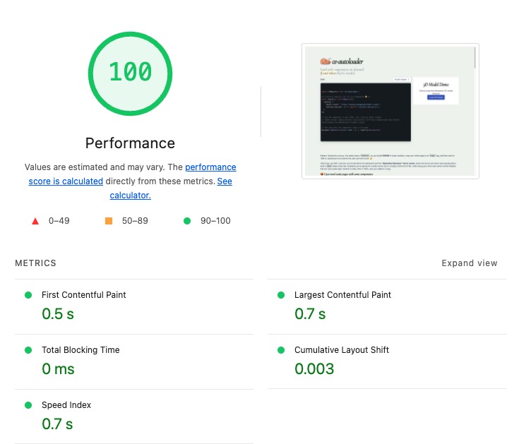
🚀 What's the performance like?
Glad you asked! Core Web Vitals with ce-autoloader matches or exceeds SSR frameworks like Next.js. Don't believe me? This is the score of the page you're reading now: